Desire to "Level Up" my abilties

  • The masquerade of murder returns! A new game of Vampires Amongst Us has begun. Unmask the killers, trust no one, and try to survive the night. Find out more and sign up now!

How would you rate my painting abilty?

  • 5 out of 5: You insult us with your humble statements - You're models look flawless

    Votes: 0 0.0%
  • 4 out of 5: You are WAY better than you lead on, but not perfect. Some areas could use minor improve

    Votes: 2 20.0%
  • 3 out of 5: Average. Nothing special really, but table-top worthy. Plenty of room for improvement,

    Votes: 2 20.0%
  • 2 out of 5: Yup - you're right. You're not that good and you need a lot of help. Don't worry, we'll

    Votes: 5 50.0%
  • 1 out of 5: You are worse than you think you are. It's gonna be a long road... *cracks knuckles* Le

    Votes: 1 10.0%

  • Total voters
    10
  • Poll votes is visible for users with special permission.

TheTrev0

Zombie
Apr 23, 2013
8
Zombies
29
Hello all!

I've already introduced myself in the New Blood Thread (found here) section and now I am posting here for help and advice.

I have already finished my Ogre Kingdoms army and Vampire Counts will be my second army. That being said, my ogres look terrible and I don't ever get considered for "Best Painted," and I want my Vampire Counts to really shine and pull above others. I want to be proud of my army!

But I need the XP so I can level up!


tumblr_m0si19YsP91qf9mevo1_500.webp


So let me first start by saying how excited I am about starting the Vampire Counts and how much more excited I am about improving my painting abilities. I look forward to documenting the entire process from beginning to end, of course, with the intentions of building this army “together” and getting all of the good advice from you experienced folks!

Next on the agenda is that I am very aware of my poor painting abilities and I am aware of one of my biggest mistakes already, which is, too much paint! I would just glob it on in the hopes I only had to do one coat. Bad! Because I am aware that I am not good at painting, I am asking that we don’t repeat that (haha).

What I would really appreciate is specific constructive criticism. My above comment is a perfect example: “You use too much paint.” This way I know something that I can do to improve upon.

The next request I am asking for (politely) is HOW to do the things that I should be doing. I still don't get washing. With my ogres, I just took a black wash and ran it all over the guys! It really helped out a lot and I LOVED the improved look. But I see people all over the place using different colored washes and only on specific areas.

Anyways...

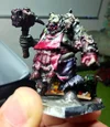
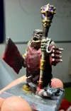
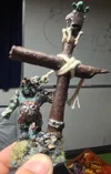
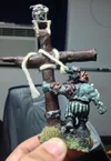
Without further ado, I invite you now to take a look at the attached photos. Sadly, I am considering these to be my “Best Painted Models.” There are a few things to take note of:

1) My entire Ogre Army has a “grungy” and ugly skin-tone theme; a mix between the greyish skin tone it was when I started with the Ogres (6th edition armybook with 8th edition’s release) and the old school green (Which everyone thinks “green” when they think of Ogres). So I wanted them to look nasty and displeasing.

2) I did not paint the beautiful stripes on my BSB Bruiser … that was my wife’s work and she did an amazing job!

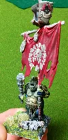
3) I did hand-paint the Maw symbol on the red Ogre Banner Carrier (Core Troop Choice). It’s my favorite ogre I’ve ever painted and ironically… that was literally the first model I painted (2 ½ years ago when I first started). I guess I got sloppy as I went on and lost interest.

My Vampire Counts come in today and I’ll be taking photos of them and getting ready for my first post of my blog or... plog? (Someone said “plog” … whats the difference?)


Anyways, I understand that each forum post/thread needs to focus on a single topic. This post's topic is my ogres and "What I did wrong"


So take a look at the Ogres and tell me ... "What I did wrong"

(*I Posted 2 pictures right into the thread for easy access and viewing. The others [including these two] are made available by attachments at the bottom*)


BSB Bruiser (Rear)
photo5.webp


Ogre Core Troop Choice Banner Holder
photo1.webp


The pictures aren't great, but I hope that the Rear BSB and the Ogre Core Troop choice are clear enough for you to see my intentions.

I can handle constructive criticism very well, so don't be shy or worried about how to say something. Just say it and it'll be a lot easier for all of us.

If you have questions let me know.


Thank you all for your help! I am excited about starting this process!


-Trevor
 

Attachments

  • photo 1.webp
    photo 1.webp
    94.1 KB · Views: 77
  • photo 2.webp
    photo 2.webp
    80 KB · Views: 76
  • photo 3.webp
    photo 3.webp
    63.7 KB · Views: 82
  • photo 4.webp
    photo 4.webp
    54.1 KB · Views: 77
  • photo 5.webp
    photo 5.webp
    92.9 KB · Views: 69
Well one thing I would do is start a painting Log many of us call these plogs. Please explain like you did here that your after criticism. So to enhance your abilities.

The monthly challenges we hold are also a great place to increase your skill both with modeling and painting check them out.

now onto the help. I feel that no matter how good a person is, if they reach the point they feel they have nothing left to learn or improve, they may as well break their brushes. Sorry if I come off as being all know it all-ish, I often teach others at the Local game store to paint, or give them tips and tricks to improve.

I've never understood the green or grey skin, in my mind ogres should be flesh toned. (That's just me...)
Though you have done well with the green, I do feel a green wash over just the green skin areas would help define the muscle tone.
(Bear with me, I suggest washes for a lot of things. One might go so far as to think I have a stake in the wash stock. :perv: )

Your freehanding on the banner is spectacular, I'm very impressed by it. I might suggest a more natural wood color, but that's my paint style is a lot of natural colors with a few accents of bright coloring.

The blood on the Butcher seems a bit bright to be dried, and a bit matte to be fresh. If you wanted it to look like fresh blood, a coat of gloss would help. If you want it to look dried, a light wash of mud/earthshade over the blood wold help with that. Another thing I found distracting was the yellow on the staff... is it Non metallic metal? If so, a softer yellow/white highlight to tone it down would really tie it together. If it's an actal gold, a wash of mud or black would make it more natural looking.

The ogre with the meat tenderizer looks good, I like the shiney blood on his apron. You missed the eyes on the gnobler, but overall I'm impressed with him.

Feel free to ask specific questions, I hope you don't feel anything I said was overly critical. I do my best not to bite too soon. (Without permission, that is.) :konrad:
 
Santawraith said:
Well one thing I would do is start a painting Log many of us call these plogs. Please explain like you did here that your after criticism. So to enhance your abilities.

Got cha - I wondered what a "Plog" was haha! Now I know. And I'll make sure to put that in my comments.

Santawraith said:
now onto the help. I feel that no matter how good a person is, if they reach the point they feel they have nothing left to learn or improve, they may as well break their brushes. Sorry if I come off as being all know it all-ish, I often teach others at the Local game store to paint, or give them tips and tricks to improve.

Well said and I agree 100%. I often say that in my own personal life

Santawraith said:
I've never understood the green or grey skin, in my mind ogres should be flesh toned. (That's just me...)
Though you have done well with the green, I do feel a green wash over just the green skin areas would help define the muscle tone.
(Bear with me, I suggest washes for a lot of things. One might go so far as to think I have a stake in the wash stock. :perv: )

Well you have to understand that the flesh tone hasn't really big a "big" thing (or at least to my knowledge) until this recent 8th edition army book. In my 6th edition books, they look much... sicker. I always interpreted as lingering damage from the radiation of the Maw. Now that they have migrated west and away from it, they have returned to their healthy skin. My tribe however hasn't. It's become "Who they are."

Santawraith said:
Your freehanding on the banner is spectacular, I'm very impressed by it. I might suggest a more natural wood color, but that's my paint style is a lot of natural colors with a few accents of bright coloring.

Thanks a lot! Ya - freehanding is fun to me and I feel it's one of my stronger suits. I'll be doing a lot of it with my Vampire Counts (especially the banners) so hopefully I can make some pretty radical images.

Santawraith said:
The blood on the Butcher seems a bit bright to be dried, and a bit matte to be fresh. If you wanted it to look like fresh blood, a coat of gloss would help. If you want it to look dried, a light wash of mud/earthshade over the blood wold help with that. Another thing I found distracting was the yellow on the staff... is it Non metallic metal? If so, a softer yellow/white highlight to tone it down would really tie it together. If it's an actal gold, a wash of mud or black would make it more natural looking.

All of this ... It's so amazing:Vampire1:

I never thought of what you just said! I'll have to keep that in mind with my vampires! Most of the blood with my VC army is going to be fresh blood (as if from that battle) so I'll make sure to go with the gloss!

As for the yellow... it's supposed to be gold so I'll keep a mental note on washing it to make it look more like metal.


Santawraith said:
The ogre with the meat tenderizer looks good, I like the shiney blood on his apron. You missed the eyes on the gnobler, but overall I'm impressed with him.

He's actually my most recent job! So it's good that I improved a little. Ya... stupid gnoblar - Ain't nobody got time for Gnoblars
Aint-Nobody-Got-Time-for-That-150x150.webp


Santawraith said:
Feel free to ask specific questions, I hope you don't feel anything I said was overly critical. I do my best not to bite too soon. (Without permission, that is.) :konrad:

Oh you made some very amazing comments that I need to really think about. Washes are my biggest weakness along with matte/gloss. So I'll make sure to ask questions per model as they come along.

With me you always have permission to be critical! I prefer it actually.
 
Santa already said most of what I had in mind.

You mentioned you don't really get washing. Well, washing is technique when you apply thinned color, which then flows into recesses of the model. It is great technique for all different kinds of shading. You mentioned you use black wash, which is great for most purposses. For example, silver armors, swords, dark cloth etc.

To the color of the wash. Usually, I simply use dark version of the color I want to shade with the wash. Also, you are not limited by the wash range of the gw colors. Every color can be used for washing when properly dilluted with water. The amount of the water you add to the color determines how "strong" the wash will be. Little water - the color will be stronger and on larger area. Lot of water - the color will be only in the deepest recesses of the models. I usually apply about 3-4 layers of wash, each one darker and more dilluted with water. That is why I prefer to use Vallejo inks, as they are not pre-dilluted like new GW washes.

Washing is amazing technique, but I personally feel it needs to be accompanied by some other lighting technique. I prefer either drybrush or highlight. That is because wash can give you a little "inconsistent" result on larger area and also because you usually only use it to darker things. That's why I apply drybrush or highlight after wash.

To when to use it: You can use in most cases. You should keep in mind that the dilluted color will flow to the recesses, so I don't recommend to use it on small areas with only few gaps, but which are overally raised on the model, until you are sure what you are doing. Wash is best in places with a lot of recesses and in larger areas that need shading. Most common use would be for hair, skin, cloth, armor, fur, rocks etc.

For example, when I paint dark red cloth, I follow this:
Paint it with mix of Blood red and Chaos black (about 5:1, only a bit of chaos black)
Apply heavy wash with mix of B.red and black ink (about 3:1, dilluted with some water)(black ink is vallejo color)
Apply medium wash with mix of B.red and black ink (about 1:1, dillted with more water)
Apply light wash with black ink (dilluted with a lot of water)

Highlight with similar mixes, only backwards (from darkest to pure Blood red)

Example of result of such work(banner and cloth on horse):
http://fc09.deviantart.net/fs70/f/2012/227/e/b/wight_lord_1_by_wh_reaper-d5b7phn.jpg

I also agree with Santa on the blood. You can check my blood tutorial if you are interested, link is in my signature ;)

Btw. your freehand looks very good :thumbsup:
 
Zhatan said:
I think that you do need more practice painting to get a feel for what works but I also think you should read articles and watch videos to get more information on color and lighting theory.
You should also read up on some basic techniques like using washes and drybrushing as that is a good start imo.

Ma nigga!

I agree with Zhatan (And G.I.Joe for that matter); Knowing is half (At least) of the battle. Personally, as of this time, I have spent well over 75% of my more serious painting career just watching videos of very good painters on youtube, reading various articles from a plethora of sites, and even the odd White Dwarf I have laying around. Although I swear to god they omit steps, sometimes they are like "Just wash it darker" and they've changed like 2-3 tones of colour. That or they are painting fairly remedial models.

Usually I'll stick to reading about a technique I'm trying to execute currently, but general paint tips help always.

But really, all you need to get better is a desire and drive to improve. If you have that, it should come fairly quickly, especially with any nudging/advice from those more skilled.

And since you mentioned Washes being a weaker point, here's a fairly decent video on them (And only like 8 minutes!)

[video=youtube]http://www.youtube.com/watch?v=OlJVubeExvk[/video]
 
Well looking at your work.
The banner Bearer is table top standard but the smaller ones need allot of work.

Its nothing to worry about as we have all been there, I think the main problem comes from bad colour choice and instead of shading and building colours up there is often a blob of in your face colour.
Neat painting and washes will solve 99% of that, from there its all refinement.
 
Start using thinner paint is my first piece of advice. Every paint company out there ships their paint WAY to thick, thin is all down with some distilled water.

Next is always make sure your brush is clean of debris, dry paint and has a nice point. Split brushes, hooked brushes and frayed brushes should be regulated to wash brushes or even as glue spreading base brushes.

Lastly is learning to take your time even more then what you might already do. if you're questioning yourself along the way you're "doing it wrong". Stop, reevaluate your approach and correct as you go.

The first step to doing a better job at anything is to objectively determine everything you are doing a bad job at.

I have been painting models for 20+ years and every time I sit down for a centerpiece project I grill myself along the way remembering what I didn't like about the last one and I modify my technique just slightly.

Painting is evolutionary not revolutionary.
 

About us

  • Our community has been around for many years and pride ourselves on offering unbiased, critical discussion among people of all different backgrounds. We are working every day to make sure our community is one of the best.

Quick Navigation

User Menu